Colours
13th May 2015
Share:

13th May 2015
Light is one of the most important elements to feature in homes of today. Unfortunately when many period properties were designed, less importance was put on the quality and quantity of light. When choosing a colour scheme for a new kitchen, often the scars of the outdated pine cabinets with dark counter tops, dark green tiles and old slate floor give clients a negative attitude towards colour. We feel that colour should be embraced and enjoyed, allowing clients to bring their own personality and taste to a commission, rather than the often incorrect mindset of having a dark space so white or cream is the only option. We never respond to the question of “what is your favorite colour?” with beige or off white.
These colours have their place, we believe as a backdrop seen in the walls and woodwork, so we would encourage clients to be braver than they would initially feel. With our cabinets in the main being below waist height, it is rare that we ever get a full on, face height view of the cabinets. As such the view and impact is reduced by the angle that the cabinets are looked down from.
We are happy to work with clients to give them confidence to look a little further up the colour chart- a good colour not only gives the character and visual strength, but it can also bring a kitchen on from a great kitchen to an amazing one.
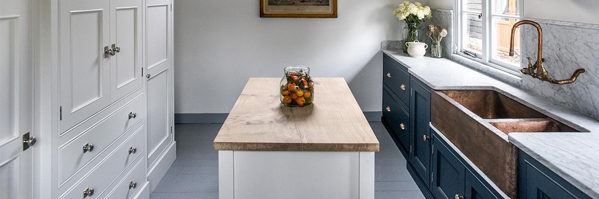
Our own personal journey with colour in our new studio barn has challenged us to be a little bold. We are in love with the Mylands colours of London and their Great British heritage fits with our ethos. In our barn the statement Copper sink sideboard is Bond Street. Our rationale with these colours was that Bond Street brings a classical, luxury element to the Carrara marble and copper detailing. The block is Alderman, which works beautifully with the English Oak counter top that is made from a single piece of Oak. For the walls and the Armoire we chose Charterhouse as an elegant white as the cabinetry itself is strong so by detailing it in the same colour as the walls this lessens the visual impact on the space. The result is a strong but elegant palette sitting beautifully in our barn.
